

2025 · heyroom
2025 · heyroom
Making the invite feature visible
Making the invite feature visible
Making the invite feature visible
Redesigning heyroom's invite flow to increase invites sent by 67% without forcing users.
Redesigning heyroom's invite flow to increase invites sent by 67% without forcing users.
Redesigning heyroom's invite flow to increase invites sent by 67% without forcing users.
Product
Product
heyroom; a C2C roommate matching app basis vibes, 30k users, Germany
heyroom; a C2C roommate matching app basis vibes, 30k users, Germany
Role
Role
Sole Product Designer
Team
Team
Founder, CTO, Developer
Timeline
Timeline
Jan–Feb 2025
CONSTRAINT
CONSTRAINT
No incentive budget
WEBSITE
WEBSITE
Outcome
Outcome
+67% invites sent · 2.27 avg invites per user · No spike in onboarding drop-off
+67% invites sent · 2.27 avg invites per user · No spike in onboarding drop-off
+67% invites sent · 2.27 avg invites per user · No spike in onboarding drop-off
Product
heyroom; a C2C roommate matching app basis vibes, 30k users, Germany
Role
Sole Product Designer
Team
Founder, CTO, Developer
Timeline
Oct–Dec 2024
CONSTRAINT
One developer, different time zone, investor deadline in 8 weeks
WEBSITE
The situation
The situation
The situation
heyroom's invite feature existed but nobody was using it. It was buried deep in the profile tab with no triggers, no value framing, no urgency. The founder wanted to make it a critical part of the product to grow the user base organically.
heyroom's invite feature existed but nobody was using it. It was buried deep in the profile tab with no triggers, no value framing, no urgency. The founder wanted to make it a critical part of the product to grow the user base organically.
The challenge: there was no incentive for users to invite friends. No referral credits, no premium access, no reward. Whatever we designed had to make users want to invite people purely through the experience itself.
The challenge: there was no incentive for users to invite friends. No referral credits, no premium access, no reward. Whatever we designed had to make users want to invite people purely through the experience itself.
The founder's initial direction was to make the invite step mandatory during onboarding. I pushed back - industry benchmarks showed up to 30% rise in abandonment when mandatory steps were added to onboarding. My challenge was to prevent a poor user experience and persuade the founder to keep it skippable.
The founder's initial direction was to make the invite step mandatory during onboarding. I pushed back - industry benchmarks showed up to 30% rise in abandonment when mandatory steps were added to onboarding. My challenge was to prevent a poor user experience and persuade the founder to keep it skippable.
Key decisions
Key decisions
Key decisions
Verification as the hook
Verification as the hook
With no budget for incentives, I needed another reason for users to act. I tied "inviting" to "profile verification" - 'Verify your profile by inviting 3 friends. This reframed the invite from a favor to a benefit: verified profiles get more trust from potential roommates.
With no budget for incentives, I needed another reason for users to act. I tied "inviting" to "profile verification" - 'Verify your profile by inviting 3 friends. This reframed the invite from a favor to a benefit: verified profiles get more trust from potential roommates.
Placement : where and when to show it
Placement : where and when to show it
I mapped the entire user journey and evaluated three entry points for "Verify your profile" trigger: after room application (moment of intent but potentially distracting), before room application (can position as trust-building), and after onboarding (low friction, clean mental break, high receptiveness). After a team poll, we aligned on showing the invite modal just after onboarding, with a persistent reminder banner on the home screen.
I mapped the entire user journey and evaluated three entry points for "Verify your profile" trigger: after room application (moment of intent but potentially distracting), before room application (can position as trust-building), and after onboarding (low friction, clean mental break, high receptiveness). After a team poll, we aligned on showing the invite modal just after onboarding, with a persistent reminder banner on the home screen.
CLICK CARDS TO VIEW ENTRY POINTS
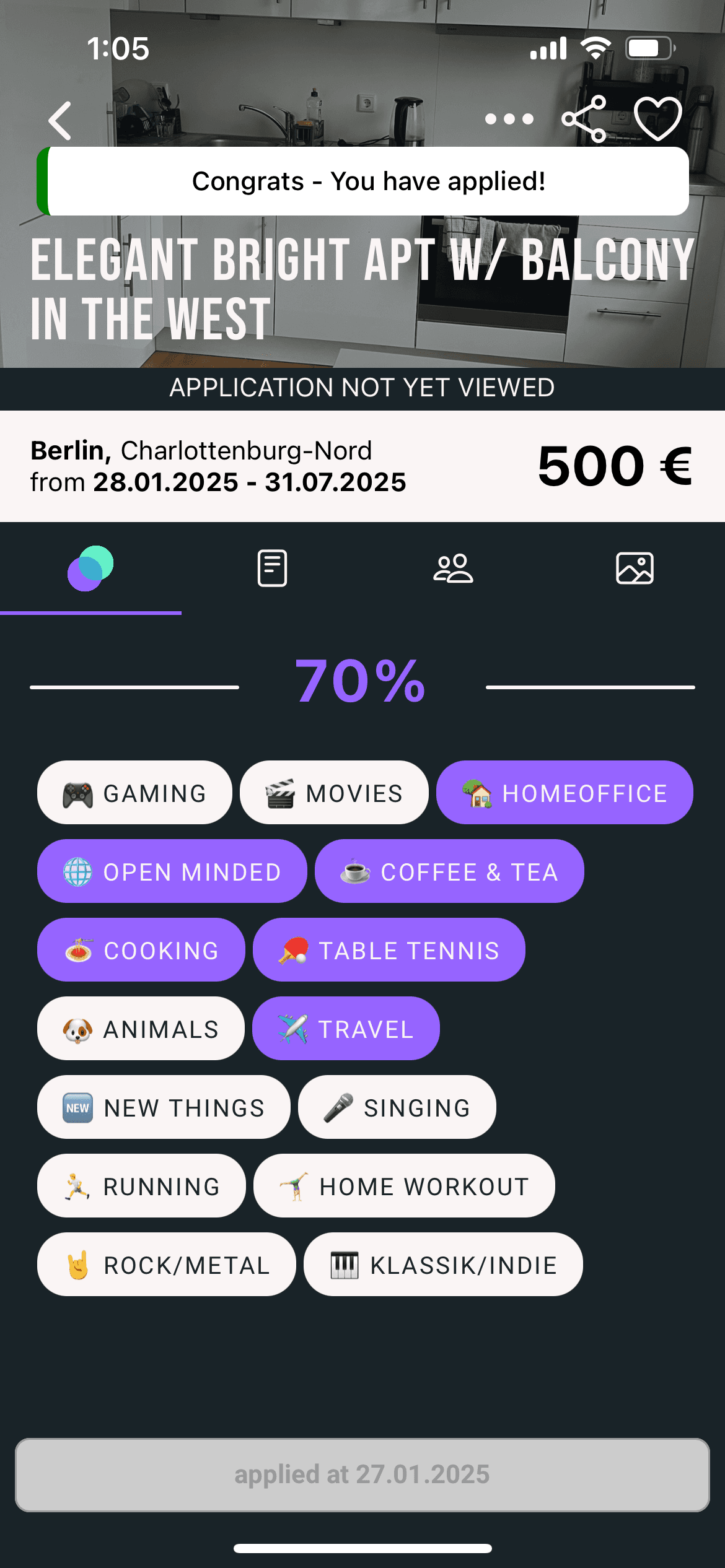
1
After room application
Moment of intent, but potentially distracting from the core action.
2
Before room application
Can position inviting as trust-building, but interrupts the search flow.
3
After onboarding
Low friction, clean mental break, and high receptiveness. This is what we chose.
4
Reminder placement
Persistent banners "Verify your profile" on Home, Applied and Chat screens keep the invite visible without interrupting.
Skippable over mandatory
Skippable over mandatory
The founder wanted to force invites during onboarding. I researched onboarding patterns and met with an investor who had a similar feature in their product. Their mandatory approach was rooted in a fundamentally different product model that is, shared calendars where inviting friends was the core action. For heyroom, where the core action is finding rooms, forcing invites would feel like a gate. I presented the research to the founder and convinced him to make it skippable.
The founder wanted to force invites during onboarding. I researched onboarding patterns and met with an investor who had a similar feature in their product. Their mandatory approach was rooted in a fundamentally different product model that is, shared calendars where inviting friends was the core action. For heyroom, where the core action is finding rooms, forcing invites would feel like a gate. I presented the research to the founder and convinced him to make it skippable.
Let it be skippable. Create an emotional nudge instead of a push.
Design evolution
Design evolution
Design evolution
01
01
01
Making it feel fun, not functional
Making it feel fun, not functional
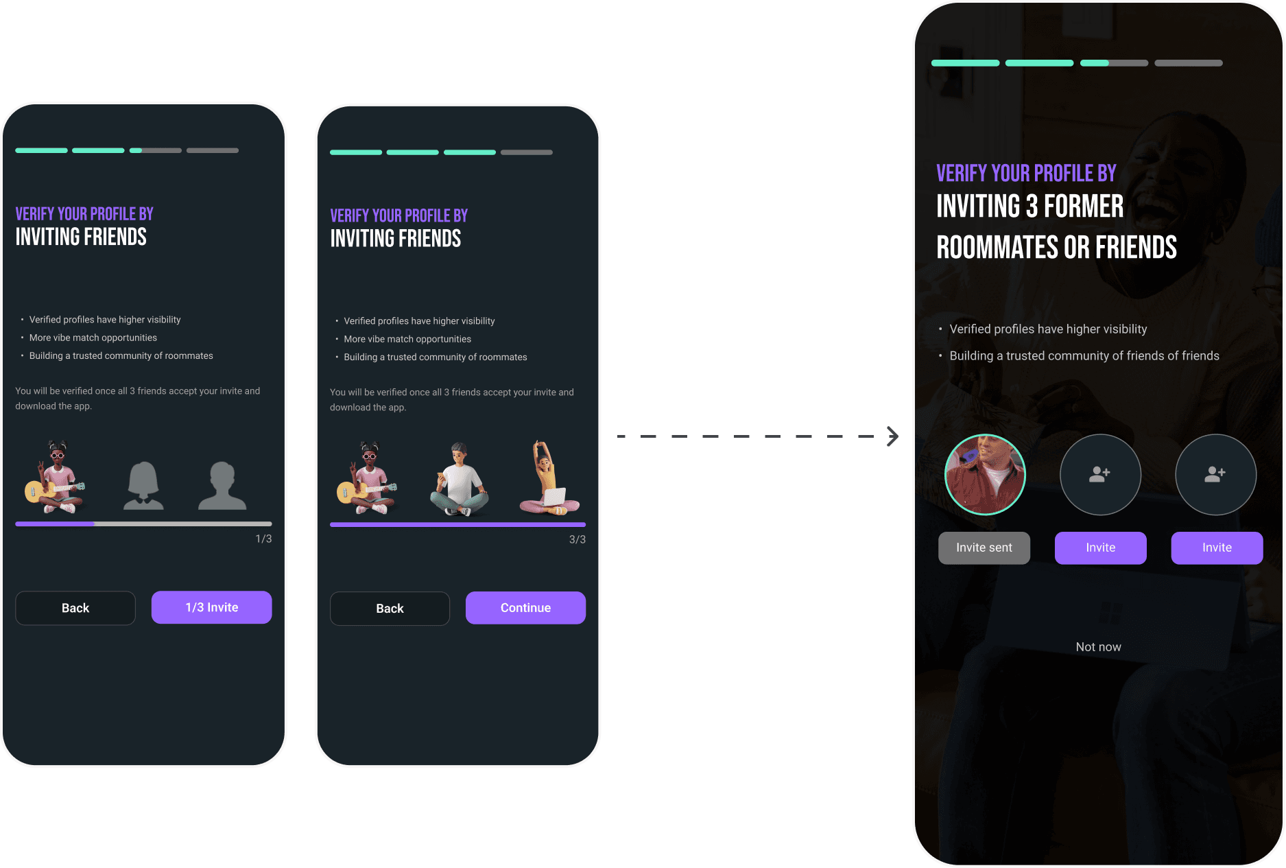
Since there was no tangible reward, I focused on making the interaction visually engaging. I drew inspiration from Snapchat's Quick Add and Blindmate's invite patterns. This led to using FRIENDS TV show gifs - nostalgic, familiar, and perfectly on-theme for roommate-finding. The gifs reveal progressively as users send invites, turning a transactional action into a moment of discovery.
Every piece of copy was written to make the free allowance feel generous, not restrictive. ‘You can only apply to 3 rooms’ feels like a restriction. ‘You get 3 free applications’ feels like a gift. Same rule, completely different perception. This was directly tied to our goal of preventing drop-off.
02
02
02
Using AI to prototype faster
Using AI to prototype faster
I also used Cursor AI to rapidly prototype interaction ideas, testing gif reveals, animation timing, and copy variations before committing to final designs in Figma. This let me explore more directions in less time and validate the gamified feel before handoff.
I also used Cursor AI to rapidly prototype interaction ideas, testing gif reveals, animation timing, and copy variations before committing to final designs in Figma. This let me explore more directions in less time and validate the gamified feel before handoff.

Cursor prototype
03
03
03
Before and after
Before and after
The old invite feature was a small link in the profile tab with no context and no motivation. The new version is a full-screen modal that appears after onboarding, frames inviting as verification, shows real contact photos, and uses one-tap invite buttons.
Every piece of copy was written to make the free allowance feel generous, not restrictive. ‘You can only apply to 3 rooms’ feels like a restriction. ‘You get 3 free applications’ feels like a gift. Same rule, completely different perception. This was directly tied to our goal of preventing drop-off.
TOGGLE TO COMPARE
BEFORE
AFTER

Shipping
Shipping
Shipping
Remote team, no design system, part-time developers. I used FigJam & Loom for async walkthroughs, Discord for quick decisions, and Figma for structured handoff. Designed from existing app screenshots since no component library existed.
Remote team, no design system, part-time developers. I used FigJam & Loom for async walkthroughs, Discord for quick decisions, and Figma for structured handoff. Designed from existing app screenshots since no component library existed.

Team meetings
Outcome
Outcome
Outcome
+67% invites sent · 2.27 avg invites per user · No spike in onboarding drop-off
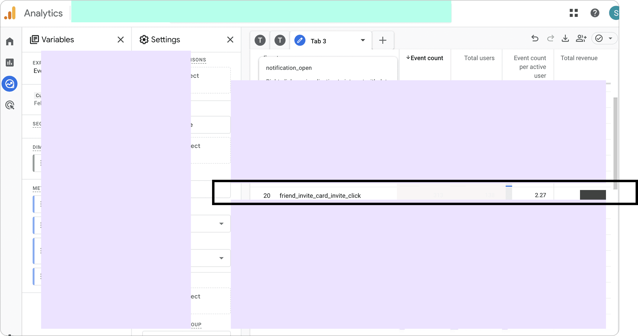
Within two weeks of launch, invites sent increased by 67%. Users were sending an average of 2.27 invites each, without any external incentive. Onboarding drop-off remained flat, confirming that the skippable approach was the right call.
Within two weeks of launch, invites sent increased by 67%. Users were sending an average of 2.27 invites each, without any external incentive. Onboarding drop-off remained flat, confirming that the skippable approach was the right call.
Google Analytics
Reflections
Reflections
Reflections
Defending a design decision with data
Defending a design decision with data
Convincing the founder to keep the invite step skippable required more than opinion. I gathered industry benchmarks, arranged a meeting with an investor, and presented a clear case. This taught me that design decisions at startups need to be defended with evidence, not just rationale.
Working directly with a founder means priorities shift daily. Early on, last-minute changes were derailing both my timelines and the developer’s. I started documenting every decision and the reasoning behind it which made it easier to push back, and easier for the founder to see when a change had downstream costs.
Working end-to-end as sole designer
Working end-to-end as sole designer
From competitive research to onboarding copy to pixel handoff, I owned every step. Working with remote part-time developers and navigating multiple feedback sources forced me to stay focused on what mattered for the user.
I’d design for German copy from the start. Retrofitting the multilingual layout cost 3–4 days we didn’t have.