
2024 · heyroom
2024 · heyroom
Free app to first revenue
Free app to first revenue
Free app to first revenue
Designed heyroom’s first paid feature without killing engagement.
Designed heyroom’s first paid feature without killing engagement.
Designed heyroom’s first paid feature without killing engagement.
Product
Product
heyroom; a C2C roommate matching app basis vibes, 30k users, Germany
heyroom; a C2C roommate matching app basis vibes, 30k users, Germany
Role
Role
Sole Product Designer
Team
Team
Founder, CTO, Developer
Timeline
Timeline
Oct–Dec 2024
CONSTRAINT
CONSTRAINT
One developer, different time zone, investor deadline in 8 weeks
WEBSITE
WEBSITE
Outcome
Outcome
+14% DAU · No increase in drop-offs · 12 payments in week one
+14% DAU · No increase in drop-offs · 12 payments in week one
+14% DAU · No increase in drop-offs · 12 payments in week one
Product
heyroom; a C2C roommate matching app basis vibes, 30k users, Germany
Role
Sole Product Designer
Team
Founder, CTO, Developer
Timeline
Oct–Dec 2024
CONSTRAINT
One developer, different time zone, investor deadline in 8 weeks
WEBSITE
The situation
The situation
The situation
heyroom was a free C2C app with 30,000 users and zero revenue.
heyroom was a free C2C app with 30,000 users and zero revenue.
The founder needed to demonstrate revenue traction to investors within 3–4 months. He wanted to make room applications which were unlimited and free into a paid action.
heyroom has two user types: Searchers looking for rooms, and Offerers listing them. This change only affected Searchers that is, the side generating demand.
The founder needed to demonstrate revenue traction to investors within 3–4 months. He wanted to make room applications which were unlimited and free into a paid action.
heyroom has two user types: Searchers looking for rooms, and Offerers listing them. This change only affected Searchers that is, the side generating demand.
I asked whether we should fix existing UX problems first. The app had overloaded screens, spacing issues, and onboarding errors. But founder needed to show revenue proof to the investors first for future sustainability of the company.
I asked whether we should fix existing UX problems first. The app had overloaded screens, spacing issues, and onboarding errors. But founder needed to show revenue proof to the investors first for future sustainability of the company.
The risk was real. Searchers had never paid for anything in this app, and room supply was limited. If users paid and then couldn't find suitable rooms, they'd leave permanently. Whatever we built had to introduce payment without breaking the core experience.
The risk was real. Searchers had never paid for anything in this app, and room supply was limited. If users paid and then couldn’t find suitable rooms, they’d leave permanently. Whatever we built had to introduce payment without breaking the core experience.
Key decisions
Key decisions
Key decisions
Pricing Models we evaluated and rejected
Pricing Models we evaluated and rejected
Subscription
Room search ends once you move in. A monthly subscription charges users for time they don't need.
Room search ends once you move in. A monthly subscription charges users for time they don’t need.
Credit system
Users have to track a balance and calculate costs per application.
Users have to track a balance and calculate costs per application.
Hard paywall
With limited room supply, users who paid and found nothing would leave permanently.
With limited room supply, users who paid and found nothing would leave permanently.
Freemium over hard paywall
Freemium over hard paywall
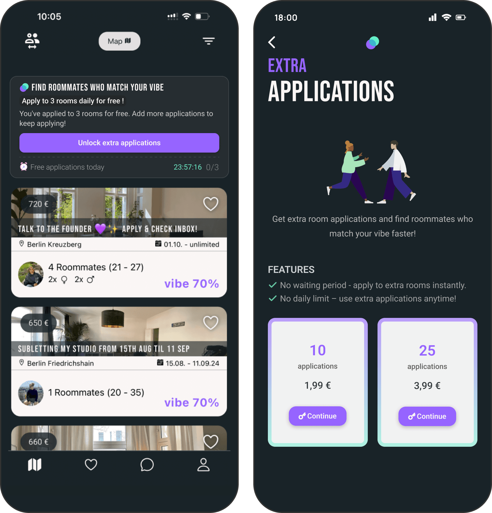
I worked with the founder to align on a freemium model: 3 free applications per day, with the option to buy bundles of 10 or 25 more. Users experience value first and pay only when they want more.
I worked with the founder to align on a freemium model: 3 free applications per day, with the option to buy bundles of 10 or 25 more. Users experience value first and pay only when they want more.
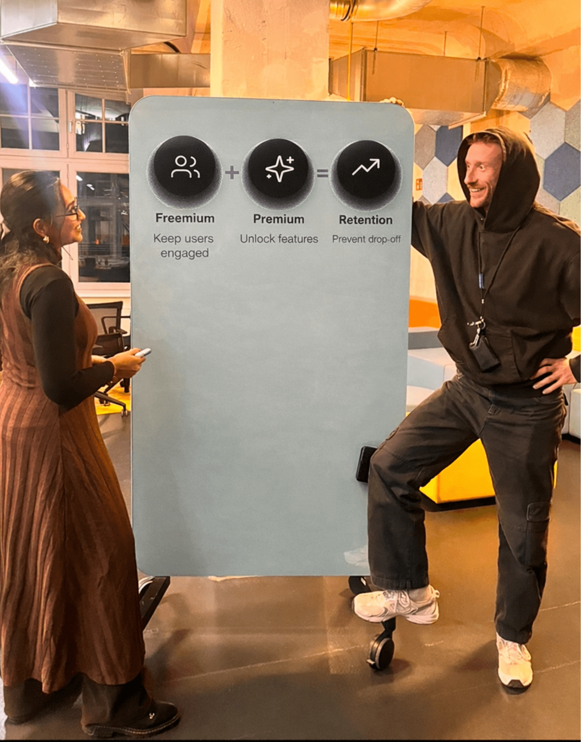
Working through the pricing strategy with the founder
Reframing the success metric
Reframing the success metric
Revenue was the obvious KPI, but I pushed back. With limited room supply, low revenue wouldn't mean the design failed. It could just mean there weren't enough rooms to apply to. The metric that would actually tell us if the model & design was working was engagement: were users coming back daily to use their 3 free applications? Were drop-offs increasing or staying flat? We tracked both.
Revenue was the obvious KPI, but I pushed back. With limited room supply, low revenue wouldn’t mean the design failed. It could just mean there weren’t enough rooms to apply to. The metric that would actually tell us if the model & design was working was engagement: were users coming back daily to use their 3 free applications? Were drop-offs increasing or staying flat? We tracked both.
The goal: Introduce a freemium model that prevents drop-off, increases daily engagement, and generates revenue.
Design evolution
Design evolution
Design evolution
01
01
01
Framing limits as benefits
Framing limits as benefits
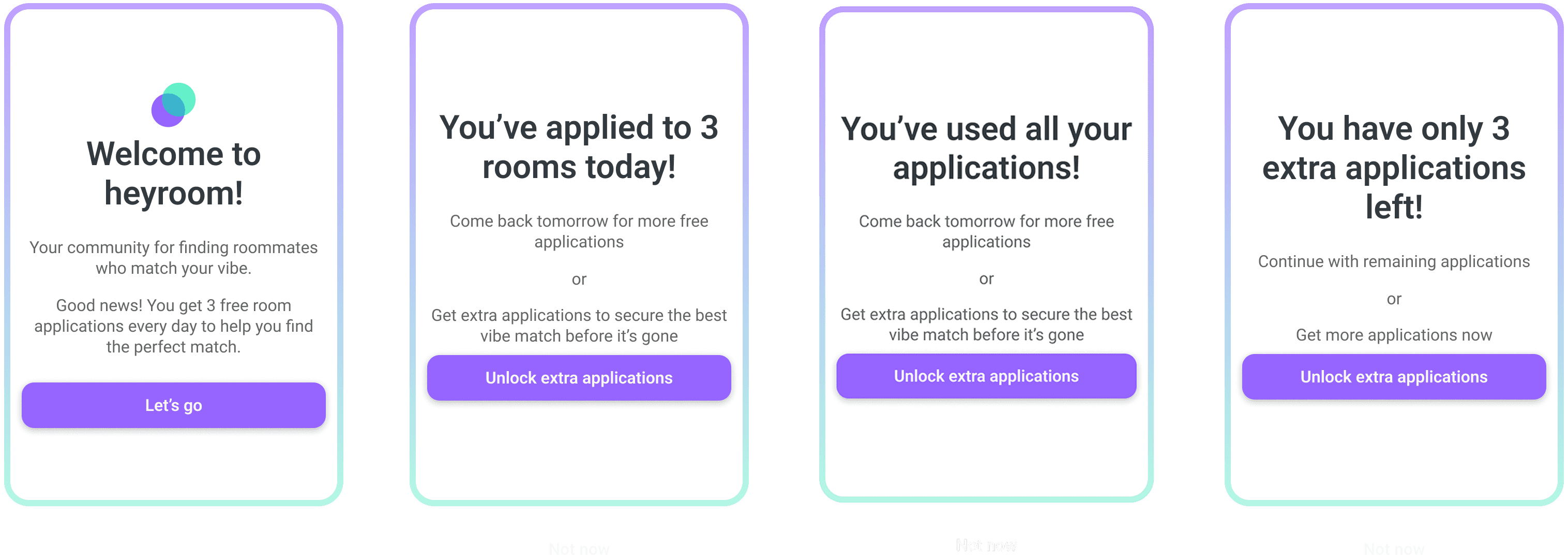
Every piece of copy was written to make the free allowance feel generous, not restrictive. 'You can only apply to 3 rooms' feels like a restriction. 'You get 3 free applications' feels like a gift. Same rule, completely different perception. This was directly tied to our goal of preventing drop-off.
Every piece of copy was written to make the free allowance feel generous, not restrictive. ‘You can only apply to 3 rooms’ feels like a restriction. ‘You get 3 free applications’ feels like a gift. Same rule, completely different perception. This was directly tied to our goal of preventing drop-off.


02
02
02
Users always know where they stand
Users always know where they stand
I designed a feedback loop for every stage: a welcome card for first-time users, a counter showing remaining free applications, a modal when applications run out with a timer for the next reset, and a purchase dialog for buying more. No dead ends - every state tells the user exactly what to do next.
I designed a feedback loop for every stage: a welcome card for first-time users, a counter showing remaining free applications, a modal when applications run out with a timer for the next reset, and a purchase dialog for buying more. No dead ends - every state tells the user exactly what to do next.
03
03
03
Testing with real users
Testing with real users
I tested the prototype with 5 users in Berlin who were actively living in shared apartments.
3 key findings:
Info cards showing application count looked tappable - I darkened them to read as status indicators, not buttons.
I tested the prototype with 5 users in Berlin who were actively living in shared apartments.
3 key findings:
Info cards showing application count looked tappable - I darkened them to read as status indicators, not buttons.

Users were clicking pricing cards without reading benefits - I restructured to show benefits before pricing, following the principle of establishing value before cost.
The overall UI felt dense, but I left that alone - fixing existing visual debt wasn't in scope for this release.
Users were clicking pricing cards without reading benefits - I restructured to show benefits before pricing, following the principle of establishing value before cost.
The overall UI felt dense, but I left that alone - fixing existing visual debt wasn’t in scope for this release.

04
04
04
Catching the localisation problem
Catching the localisation problem
We designed in English and missed that German words are significantly longer. The horizontal unlock card was covering the room listings in the German version. I consulted senior designers working on multilingual apps and switched from horizontal to vertical layout. Fix took 3–4 days.
We designed in English and missed that German words are significantly longer. The horizontal unlock card was covering the room listings in the German version. I consulted senior designers working on multilingual apps and switched from horizontal to vertical layout. Fix took 3–4 days.

05
05
05
Prototype
Prototype
Shipping
Shipping
Shipping
There was no design system and no Figma files when I started. The developer was working from screenshots and video recordings of other apps shared by the founder, which led to misinterpretation and inconsistent UI.
There was no design system and no Figma files when I started. The developer was working from screenshots and video recordings of other apps shared by the founder, which led to misinterpretation and inconsistent UI.
I introduced Figma as the single source of truth for handoff and used Loom walkthroughs to explain flows asynchronously across time zones. This closed the gap between design intent and implementation.
I introduced Figma as the single source of truth for handoff and used Loom walkthroughs to explain flows asynchronously across time zones. This closed the gap between design intent and implementation.
Delivery time dropped from 3 months to 2 months compared to previous feature cycles.
Delivery time dropped from 3 months to 2 months compared to previous feature cycles.

Figma file structure: developer handoff, design reviews, and flow documentation
Outcome
Outcome
Outcome
+14% DAU · No increase in drop-offs · 12 payments in week one
In the first week after launch, daily active users increased by 14% compared to the previous month. Drop-offs did not increase. We defined an active user as someone who opened the app and viewed at least one listing. Users were coming back daily to use their 3 free applications, and some were buying bundles. That proved two things the investor meeting needed: genuine demand on the platform, and willingness to pay.
In the first week after launch, daily active users increased by 14% compared to the previous month. Drop-offs did not increase. We defined an active user as someone who opened the app and viewed at least one listing. Users were coming back daily to use their 3 free applications, and some were buying bundles. That proved two things the investor meeting needed: genuine demand on the platform, and willingness to pay.
Reflections
Reflections
Reflections
Managing shifting priorities
Managing shifting priorities
Working directly with a founder means priorities shift daily. Early on, last-minute changes were derailing both my timelines and the developer's. I started documenting every decision and the reasoning behind it which made it easier to push back, and easier for the founder to see when a change had downstream costs.
Working directly with a founder means priorities shift daily. Early on, last-minute changes were derailing both my timelines and the developer’s. I started documenting every decision and the reasoning behind it which made it easier to push back, and easier for the founder to see when a change had downstream costs.
Designing for German copy from day one
Designing for German copy from day one
I'd design for German copy from the start. Retrofitting the multilingual layout cost 3–4 days we didn't have.
I’d design for German copy from the start. Retrofitting the multilingual layout cost 3–4 days we didn’t have.
Working end-to-end
Working end-to-end
As the sole designer I owned everything from user research and strategy to copywriting and developer support. That forced me to defend every design decision with research and data rather than opinion and to stay focused when feedback came from multiple directions.